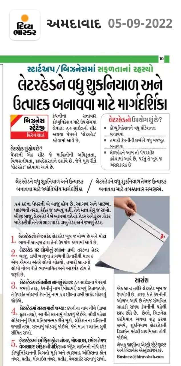
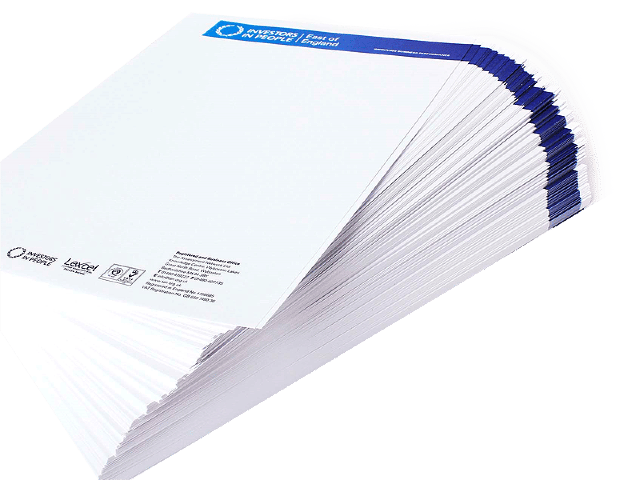
An A4 sheet of paper intended for use in official communication that comes from a company or organization is referred to as a “letterhead“.
Table of Contents
What is a letterhead?
A physical sheet of paper which communicates the “official-ness“, authenticity, credibility, reliability, and legitimacy of the information in it, is basically what is called a “letterhead”.
What is the use of a letterhead?
1. To make the communication look professional
All of your work-related correspondence, if in hard copy, should be on a quality paper with a well-designed letterhead.
It is used to project formality, decorum, and consistency. Thus, if you want to make the communication or transaction look professional, you ought to use a letterhead on your documents.
Beyond good communication and formalities, letterheads are used to show that the information contained within them is trustworthy, reliable, and valid.
2. To strengthen your company image
Letterheads are used to reinforce your company’s image through effective communication. Whether the motive of the document is to convey about your business’s product or service, an internal or external matter, or simply for notability, a standard and quality letterhead enhances your business’s image.
“Letterheads may refer to a sheet of paper, but their impact is enormous”.
Let’s understand step by step how to make letterheads more productive & auspicious!
Astrological Guidelines to have an Auspicious and Productive Letterhead Design
Your letterhead is being made to communicate seriousness, stability and consistency, thereby attracting potential clients and hence businesses, therefore to put your business to grow, it’s imperative to follow these tips.
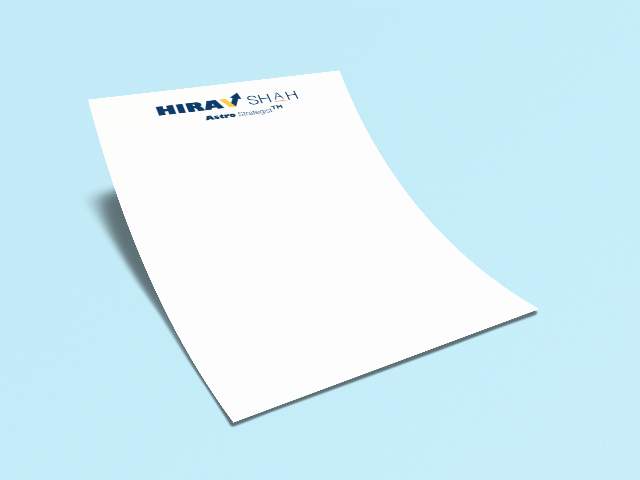
1. Color of the Letterhead
White letterheads are most suitable and safe and are used by most brands. However, classic color combinations which are timeless & professional, and which work on any style of letterhead are Black and White, Navy and Blue cream.
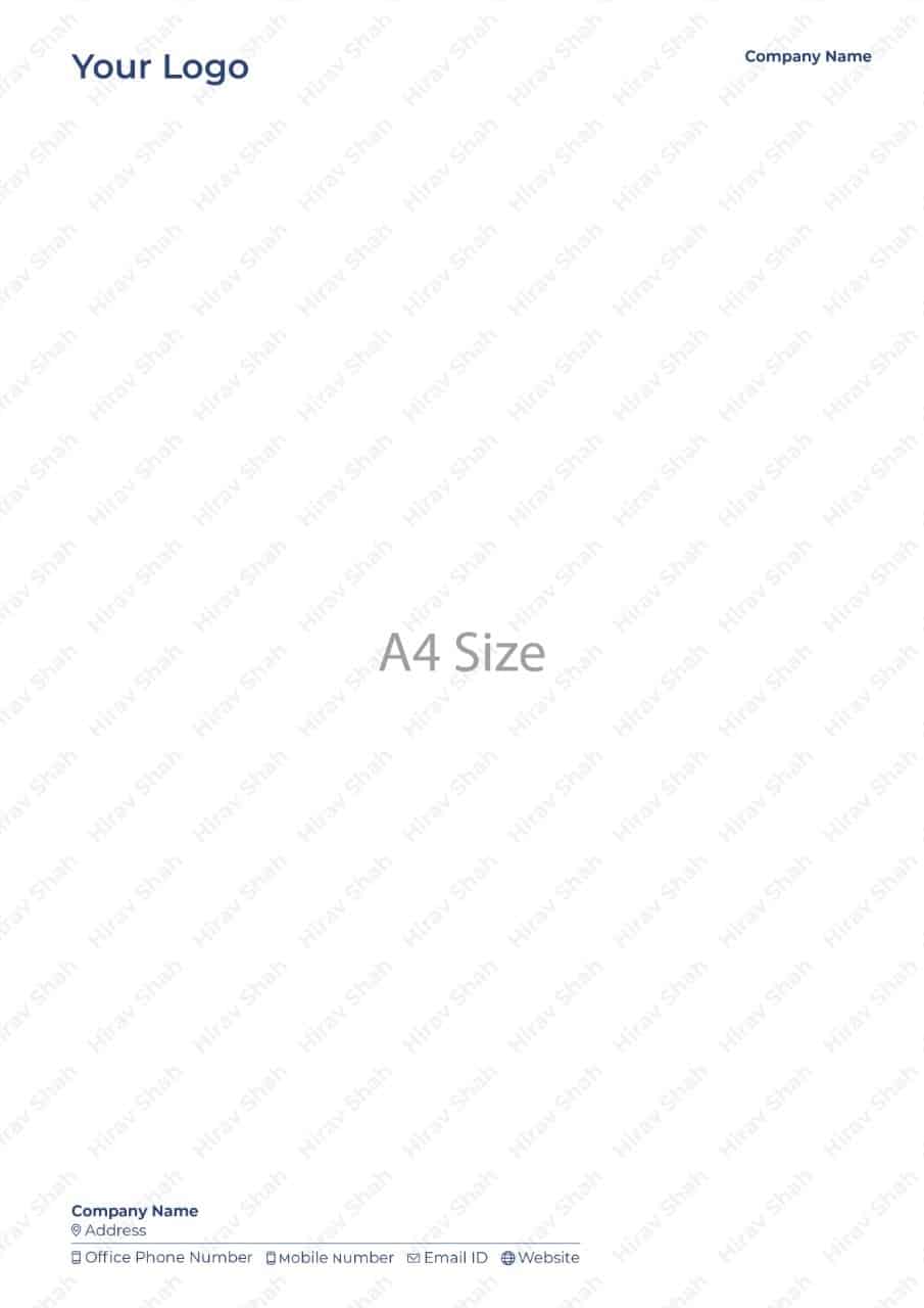
2. Position of Logo on Letterhead
![]()
Let’s say there are two sides to an A4 Size paper. Front and back. On the back side, don’t put anything. Just nothing. Leave it plain.
On the other side of the letterhead, divide it into 2 parts. Header and Footer. For the Header, divide again 2 parts. Left Header, Right Header, For the Footer, again divide two parts. Left Footer and Right Footer.
On the left Header side, the logo needs to be placed just 6 mm distance away from the left edge of the paper. Your brand logo needs to be very well-defined and noticeable.
3. Position of Company Name on Letterhead
On the right side of the A4 Size paper, the Company Name needs to be placed at the right header, leaving just 6 mm distance away from the right edge of the paper(& aligning to its left). The Company Name(in Bold) needs to look distinct and prominent as well.
The Company Name(in bold) needs to be also placed at the Left Footer side of the A4 Sheet, leaving 6 mm from the left edge. Reiterating, the Company Name needs to look definite and distinctive.
4. Position of Address on Letterhead
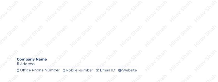
Just Below the Company Name (at the left footer), the address to be placed like this.
First, the location symbol needs to be placed “symbolically”. Towards the right of the “location symbol”, the “Address” write up needs to be written and then to its right, the address needs to be placed, summing up in one line only.
Below the Address, a straight line needs to be drawn starting from the startpoint (3 mm from left) till the endpoint (9 mm from right).
5. Position of Office Phone Number on Letterhead
Just Below the line, the Office Phone Number needs to be placed like this.
First, the telephone symbol needs to be placed “symbolically”. Towards the right of the “telephone symbol”, the Office Phone Number needs to be written.
6. Position of Mobile Number on Letterhead
Towards the right of the Office Phone Number, a space needs to be put and then, to its right the Mobile Number needs to be placed like this.
First, the telephone symbol needs to be placed “symbolically”. Towards the right of the “telephone symbol”, the Mobile Number needs to be written.
7. Position of Email ID on Letterhead
Towards the right of the Mobile Number, a space needs to be put and then, to its right the Email ID needs to be placed like this.
First, the Email symbol needs to be placed “symbolically”. Towards the right of the “Email symbol”, the Email ID needs to be written.
8. Position of the Website on Letterhead
Towards the right of the Email ID, a space needs to be put and then, to its right, the Website needs to be placed like this.
First, the Website symbol needs to be placed “symbolically”. Towards the right of the “Website symbol”, the Website needs to be written.
Final Thoughts

A letterhead is as crucial as a brand, in that it depicts a company and can impart a first impression to its potential customers.
Therefore, a letterhead design must be auspicious and productive, otherwise folks might assume the business is less competent and proficient and not one they want to have any dealings with.
Lastly, while starting or doing a business, designing an auspicious letterhead should be the first priority.