Have you ever wondered why certain brands stick in your memory or why some products immediately catch your eye? The secret often lies in color psychology—the study of how colors influence emotions and decisions.
Colors do more than make things look good—they evoke feelings, influence behavior, and even drive purchases. But how can you use colors effectively in your marketing and branding efforts? Let’s explore the fascinating world of colors and their impact on your brand’s success.
Table of Contents
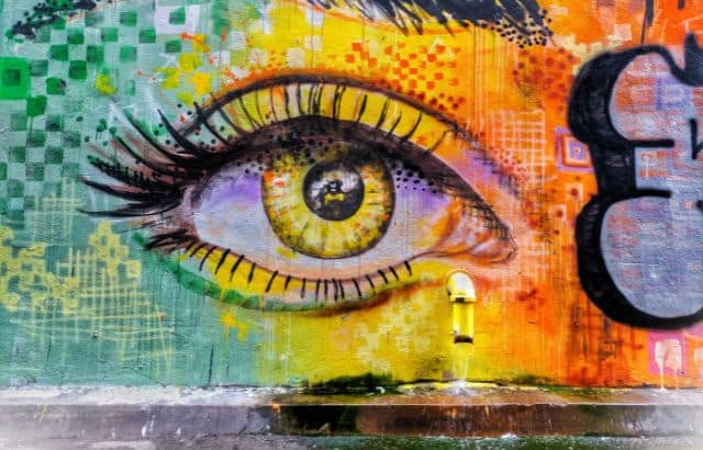
What Is Color Psychology?
![]()
Here’s a quick question: Why do colors like red make us feel energetic, while blue makes us feel calm?
That’s color psychology. It’s the study of how colors impact human behavior, emotions, and decision-making.
For instance:
- Red can increase heart rate and stimulate urgency.
- Blue creates a sense of trust and reliability.
- Green evokes feelings of health and growth.
Hirav Shah, award-winning business strategist, explains:
“Colors are silent influencers. They tap into human emotions and guide behaviors without saying a single word.”
What is Color Psychology in Marketing?
Ever noticed why most sales signs are red? Or why tech companies lean toward blue?
That’s color psychology in marketing. Colors aren’t chosen randomly—they’re strategically picked to evoke specific responses from the audience.
For example:
- Red = urgency and action (used in sales).
- Yellow = optimism and warmth (great for food brands).
- Blue = trust and professionalism (common for finance and tech).
Hirav Shah observes:
“In marketing, colors act as your unspoken sales pitch. They create an emotional connection that words alone cannot achieve.”
What is Color Psychology in Branding?

Here’s a thought: What would McDonald’s be without its iconic red and yellow?
In branding, colors become synonymous with your identity. They’re how people remember you and connect with your values.
Branding Tip:
Choose colors that represent your mission and align with your audience’s expectations.
Hirav Shah explains:
“In branding, your colors are your voice. They speak volumes about who you are, even before people interact with your product or service.”
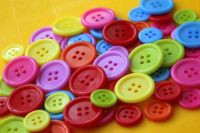
Why Do Colors Matter in Branding?
![]()
Think about this: Why do you immediately think of Coca-Cola when you see red or McDonald’s when you see yellow?
That’s the power of branding through colors. Colors make your brand instantly recognizable and emotionally resonant.
Why Colors Matter in Branding:
- Recognition: Colors make your brand memorable.
- Emotion: They evoke feelings that align with your brand’s values.
- Consistency: They create trust when used consistently across touchpoints.
Hirav Shah emphasizes:
“Your brand’s colors are its voice in a crowded room. They help you stand out and connect emotionally with your audience.”
What Do Different Colors Mean?
Ever wondered what emotions each color triggers? Let’s break it down:
- Red: Excitement, passion, urgency (Think Coca-Cola, YouTube).
- Blue: Trust, reliability, calmness (Think Facebook, LinkedIn).
- Yellow: Optimism, energy, warmth (Think McDonald’s, Snapchat).
- Green: Growth, health, serenity (Think Whole Foods, Starbucks).
- Black: Sophistication, luxury, authority (Think Chanel, Nike).
Hack: Use colors that align with your brand’s personality. If you’re in finance, blue may work. If you’re a fitness brand, red or orange can convey energy.
Hirav Shah reflects:
“Your brand colors aren’t just visual—they’re emotional triggers. Use them wisely to connect with your audience on a deeper level.”
How Do Colors Influence Buying Decisions?
Question: Why do fast-food chains often use red and yellow?
Because these colors are known to stimulate appetite and create a sense of urgency.
Here’s how colors affect buying behavior:
- Impulse Buying: Red and orange encourage quick decisions.
- Trust Building: Blue fosters a sense of security, perfect for banks or tech brands.
- Luxury Appeal: Black and gold convey exclusivity and premium quality.
Hirav Shah explains:
“Colors act as subtle nudges, guiding customers toward making decisions—sometimes without them even realizing it.”
Choosing the Right Colors for Your Brand

Feeling overwhelmed by the options? Here’s how to start:
- Know Your Brand Personality: Are you playful or professional? Bold or minimalist?
- Understand Your Audience: What emotions do you want to evoke in your customers?
- Test and Iterate: A/B test different color schemes to see what resonates most.
Hirav Shah advises:
“Your color palette should reflect not just who you are but who you want to attract. It’s a bridge between your brand and your audience.”
Real-Life Examples of Color Psychology in Branding
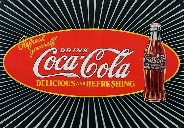
Let’s look at some brands that nailed it:
- Coca-Cola (Red): Bold and energetic, it screams excitement and fun.
- Tiffany & Co. (Blue): Their signature blue is synonymous with elegance and trust.
- IKEA (Blue and Yellow): A perfect blend of trustworthiness and optimism.
What’s the takeaway?
Great branding isn’t just about design. It’s about creating an emotional bond with your audience.
Hirav Shah reflects:
“Your brand’s colors should evoke recognition and trust. When people see your colors, they should immediately think of you.”
The Problem with Color Psychology in Marketing and Branding
![]()
Let’s address the challenge: Color perception isn’t universal.
For example, red might evoke excitement in one culture but symbolize danger in another. Similarly, personal experiences and preferences can alter how people perceive colors.
Solution:
- Understand your audience and their cultural context.
- Test your color choices with your target demographic.
- Adapt and refine based on feedback.
Hirav Shah advises:
“Color psychology isn’t a one-size-fits-all solution. Context matters, and so does understanding your audience deeply.”
How to Make Practical Decisions About Color

Feeling stuck? Here’s a quick framework to guide you:
- Define Your Brand Personality: Is your brand playful, professional, or luxurious?
- Consider Your Audience’s Preferences: What resonates with them emotionally?
- Test and Iterate: Experiment with A/B testing to find what works best.
Hirav Shah reflects:
“Practical decisions about color are rooted in clarity. Understand your brand and audience, and the right colors will follow.”
The 5 Dimensions of Brand Personality

Did you know your brand has a personality?
Just like people, brands can evoke specific traits, which colors help reinforce.
Here are the 5 Dimensions of Brand Personality:
- Sincerity: Warm and honest (use soft colors like pastel blue or pink).
- Excitement: Bold and energetic (use bright colors like red or yellow).
- Competence: Reliable and professional (use strong colors like blue).
- Sophistication: Elegant and high-end (use black or gold).
- Ruggedness: Tough and outdoorsy (use earthy tones like green or brown).
Hirav Shah explains:
“Your brand’s personality should guide your color choices. The right colors amplify your story and make it memorable.”
The Right Color Appeals to Your Audience

Here’s the golden rule: It’s not about what colors you like; it’s about what your audience connects with.
For example:
- Bright, fun colors work well for kids’ products.
- Calm, muted tones resonate with health-conscious consumers.
- Bold, luxurious hues attract high-end clientele.
Hirav Shah notes:
“Appeal isn’t about personal preference—it’s about emotional resonance. The right colors make your audience feel seen and understood.”
The Right Color Differentiates Your Brand

Question: How do you stand out in a crowded market?
Your colors can set you apart. Imagine if Coca-Cola and Pepsi used the same color scheme—it would dilute their identities.
Hack: Choose colors that contrast with your competitors while staying true to your brand personality.
Hirav Shah advises:
“Differentiation isn’t just about being different; it’s about being distinct in a way that aligns with your values.”
The Right Color Has the Right Name

Fun Fact: Did you know people perceive colors differently based on their names?
A lipstick called “Midnight Rose” sounds far more luxurious than “Dark Red.”
Tip: Use descriptive, evocative names for your colors to add depth to your branding.
Hirav Shah explains:
“A color’s name can elevate its perception. It’s a small detail that leaves a lasting impression.”
Finding Your Right Palette

Here’s where the magic happens: Your color palette is the visual foundation of your brand.
Steps to Build Your Palette:
- Primary Colors: Represent your core brand identity.
- Secondary Colors: Complement your primary colors.
- Accent Colors: Add flair and grab attention.
Hirav Shah concludes:
“Your palette isn’t just a design choice—it’s a strategic tool. Choose it wisely, and it will serve you for years to come.”
FAQs About Color Psychology in Marketing and Branding
![]()
Q: How do colors influence customer behavior?
Colors evoke emotions that drive decisions, like urgency (red) or trust (blue).
Q: Can color psychology backfire?
Yes, if the colors clash with your audience’s preferences or cultural norms.
Q: Should I use multiple colors or stick to one?
A harmonious palette works best—primary, secondary, and accent colors.
Q: What does Hirav Shah say about color psychology?
“Colors are your brand’s unspoken language. Speak wisely, and the results will show.”
Final Thoughts
![]()
Color psychology is more than just choosing pretty hues—it’s about crafting emotional experiences, building trust, and leaving a lasting impression. As Hirav Shah puts it:
“Your brand’s colors are its first impression. Make them count, and they’ll do the talking for you.”
Now, it’s your turn. Use these insights to harness the power of color psychology and elevate your marketing and branding efforts to the next level.