
Just imagine this: You walk into a boardroom to pitch your biggest deal of the year. The presentation is sharp, the numbers are strong, your strategy is airtight. Yet the client responds with hesitation. The meeting ends on a polite note—but not with a yes. A week later, you present the same pitch to another company, but this time the room is bright, your deck uses calm blues and confident golds, your outfit is intentionally chosen, and suddenly the conversation flows smoother, the energy shifts, and the deal closes.
Was it luck? Timing? Or something invisible working in your favour?
As Business Strategist and Game Changer Hirav Shah often says, “Before you speak, your colors speak for you.”
This article explores exactly that truth.
Table of Contents
What Is This Article Really About?
This is not an article about logos or design trends.
This is an article about how colors influence perception, negotiation, trust, clarity, and every business decision—across B2B, B2C, and even C2C interactions.
Color is not decoration.
Color is communication.
Color is psychology.
Color is strategy.
To help every entrepreneur, founder, or professional understand this clearly, we start with the fundamentals—simple questions and simple answers.
1. What Exactly Is a Color in the Context of Business?
A color is not just a visual element. It’s a signal.
It signals trust, urgency, luxury, speed, stability, creativity, or caution—before a single word is read.
In business, color becomes the first emotional handshake.
2. Why Are Colors Important in Business Communication?
Because 90% of first impressions are based on visual cues, and colors dominate visuals.
Colors decide whether:
– a proposal feels credible,
– a product feels premium,
– a pitch feels powerful,
– a brand feels relatable.
Color becomes your silent salesperson.
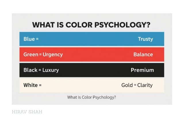
3. What Is Color Psychology?
Color psychology studies how colors affect human emotions, thinking, trust, and decision-making.
For example:
– Blue builds trust
– Red increases urgency
– Green signals balance
– Gold signals premium value
– White signals clarity
These associations influence whether someone buys, agrees, negotiates, or hesitates.
4. How Do Colors Affect B2B Communication?
In B2B, decisions are large, logical—and emotional.
Colors influence how serious, stable, and trustworthy your business appears.
Investor decks, presentations, emails, interiors, and branding all shift perception instantly.
5. How Do Colors Influence B2C Decisions?
Customers do not buy products—they buy feelings.
Color triggers emotion, and emotion drives buying.
That is why the same product can feel mass-market or luxury depending on the colors used.
6. How Do Colors Influence C2C or Personal Branding?
Your color choices in social media posts, business cards, profile photos, and even clothing create instant perception about your personality, confidence, and professionalism.
7. Do Colors Really Influence Negotiation and Decision-Making?
Absolutely.
Colors create mood, influence tone, build trust, and shift energy.
A negotiation done in a bright red environment feels aggressive.
The same negotiation in navy blue feels stable and serious.
People may not notice it consciously—but their decisions change.
How Much Power Do Colors Really Hold in Business?

More than most entrepreneurs imagine.
More than most brands intentionally use.
More than most people are even aware of.
Colors shape:
– how people see you
– how they feel about you
– how they trust you
– how they decide
Now that the foundation is clear—what colors are, why they matter, and how deeply they influence human behaviour—it is time to move from understanding to application. The real power of color emerges when we see how these psychological triggers play out in real business situations: during the first impression, in negotiations, in buyer decisions, in communication, and across brand identity. Each of these touchpoints silently shapes whether people trust you, choose you, or walk away.
To make this practical, let’s break down the journey of how colors influence business, starting from the very first moment someone sees your brand, your space, your presentation, or even you. Because perception is not built over time—it is built in seconds.
And that brings us to the first and most crucial element:
THE 5 WAYS COLORS INFLUENCE PERCEPTION, NEGOTIATION, AND DECISION-MAKING IN BUSINESS
![]()
Before diving deep, it is important to understand the five strategic areas where colors silently shape business outcomes. These five pillars explain why color psychology is not just a design element but a core business tool.
- Colors Shape First Impressions
- Colors Influence Negotiation Dynamics
- Colors Impact Decision-Making and Buying Behaviour
- Colors Communicate Value, Emotion, and Positioning
- Color Consistency Builds Recognition and Trust
BEFORE WAY 1: WHY FIRST IMPRESSIONS DESERVE PRIORITY

Every business interaction begins with perception. Before numbers, before pitch, before product features—the first impression decides whether the other person even wants to continue the conversation. And at the centre of that first impression sit colors, silently working as emotional triggers.
This is why the first of the five ways focuses on how colors shape that initial moment of trust and connection.
WAY 1: What Role Do Colors Play in Shaping First Impressions in Business?

Just imagine two scenarios.
In the first, you walk into an office with dull lighting, mismatched colors, and unclear visual identity. You immediately feel uncertain — even before a single conversation begins.
In the second, the environment is warm, the colors are intentional, the communication is visually aligned, and instantly your mind feels more open, trusting, and confident.
Nothing was spoken.
But a decision was already made inside your mind.
This is the real power of colors in the first moment of perception.
Business Strategist and Game Changer Hirav Shah often says, “People decide emotionally and justify logically. And color influences the emotional decision first.”
Below is the deeper breakdown of how first impressions are built through color:
1. Colors Trigger Emotion Before Logic Steps In
Humans are wired to react to color faster than words. In less than a second, the mind interprets a color as:
– safe or unsafe
– premium or ordinary
– trustworthy or doubtful
– serious or casual
This emotional trigger sets the tone for everything that follows.
For example:
– Blue builds trust and stability (banks, tech companies, corporate brands).
– Red sparks urgency and energy (sales, food brands, alerts).
– Green signals calm, balance, and eco-friendliness.
– Black & Gold signify premium, exclusivity, and high-value perception.
If your colors do not match the emotion you want to create, the first impression breaks before the conversation starts.
2. Colors Decide Whether People Pay Attention or Scroll Away
In digital business, the first impression lasts seconds — sometimes less.
Your website, Instagram feed, packaging, profile picture, visiting card, office interiors… colors determine whether someone:
– stays or leaves
– reads or ignores
– engages or scrolls past
High contrast, clean palettes, and intentional color use pull the eye in. Random or chaotic colors push the user away instantly.
3. Colors Signal Professionalism and Preparedness
When your colors are consistent — across slides, brochures, interiors, and communication — your business instantly looks trustworthy.
Inconsistent colors signal:
– lack of clarity
– lack of seriousness
– lack of professionalism
Clients subconsciously feel uncertain, even if your work is excellent.
Consistency communicates discipline.
4. Colors Influence the Perception of Your Price and Value
People judge pricing by color before they see the actual number.
– Premium brands use minimal colors, gold accents, and high contrast.
– Budget brands use bright, accessible, friendly colors.
– Sustainable brands use green, beige, earthy tones.
If your color choices do not match your positioning, customers feel confused — and unclear minds do not buy.
5. Colors Help People Decide Whether They Trust You
The first impression hinges on trust.
Colors boost or reduce trust instantly:
– Navy = authority
– White = honesty
– Blue = reliability
– Grey = neutrality
– Black = strength
– Orange = friendliness
If your business tone does not match the psychology of your colors, the mind says “no” before the mouth even speaks.
Hirav Shah puts it perfectly:
“The moment someone sees you or your brand, their mind takes the first decision. Make that first decision work in your favour.”
WAY 2: How Do Colors Influence Negotiation Dynamics in Business?
Have you ever felt that a meeting was going well… and suddenly the energy shifted?
No change in words.
No change in logic.
Just the atmosphere feeling different.
That atmosphere is heavily shaped by colors.
Business Strategist and Game Changer Hirav Shah often says,
“Negotiation is not just talk; it’s environment, energy, and psychology.”
Colors influence all three.
1. Colors Define the Tone of the Room
Negotiations feel different in different color environments.
– Navy Blue rooms feel serious, stable, and professional.
– Grey environments feel neutral and analytical.
– White spaces feel open, transparent, and calm.
– Bright red or orange environments create pressure, intensity, or urgency.
This is why boardrooms, investor meeting rooms, and leadership cabins rarely use loud colors — they disrupt equilibrium.
2. Colors Influence Confidence Levels
In negotiation, confidence is currency.
Your attire colors can shift perceptions instantly:
– Navy = leadership
– Black = authority
– Grey = neutrality
– White = honesty
– Earth tones = trust and warmth
These small choices influence how seriously the other person takes you.
For example, wearing navy or charcoal increases perceived credibility in financial and strategic meetings.
3. Colors Affect How People Interpret Your Proposal
Your pitch deck or proposal colors directly impact clarity and trust.
– Blue and navy create seriousness and trust.
– Red highlights signal urgency or alerts.
– Gold indicates premium value.
– Clean white space makes content easier to absorb.
A chaotic or inconsistent color scheme creates subconscious doubt, no matter how strong your actual proposal is.
4. Colors Decide How Comfortable People Feel Saying “Yes”
When the environment feels balanced, the mind feels safe.
When the mind feels safe, agreement becomes easier.
Calm colors like soft blue, muted green, warm beige, and neutrals help:
– soften resistance
– reduce tension
– create openness
– build rapport
Aggressive colors do the opposite—they increase defensiveness.
5. Colors Can Shift the Power Balance
High-contrast, bold colors (black, deep red, gold accents) convey dominance and strength.
Soft or pastel palettes convey approachability and openness.
Depending on the negotiation goal (dominance vs collaboration), choosing the right palette can influence outcomes significantly.
Negotiation is not just about the script—it’s about the setting.
Colors create the psychological climate in which decisions are made.
WAY 3: How Do Colors Impact Decision-Making and Buying Behaviour?

Most people believe decisions are logical.
In reality, they are emotional first, logical later.
And color is one of the biggest emotional triggers.
Business Strategist and Game Changer Hirav Shah explains it well:
“A single color can make someone trust you, doubt you, or buy from you — without them knowing why.”
Below is how color shapes major business decisions.
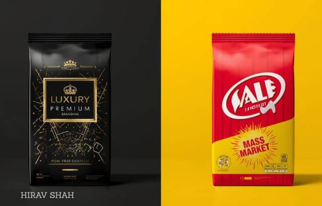
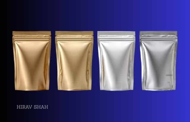
1. Colors Influence the Perceived Value of a Product or Service
Premium brands never use random colors.
They use:
– Black
– Gold
– Deep green
– White
Because these colors communicate exclusivity, purity, and high worth.
Mass brands use friendly, accessible colors (red, yellow, orange).
Value perception changes the moment the color changes.
2. Colors Decide Whether People Click, Buy, or Ignore
On digital platforms, color decisions directly affect conversion rates:
– CTA buttons in contrasting colors convert higher.
– Red creates urgency.
– Green signals go/confirm/buy.
– Black signals premium purchase.
– Blue increases trust in sign-up forms and payments.
A website with poor color psychology loses sales even if the product is excellent.
3. Colors Reduce or Increase Hesitation
Certain colors create emotional safety:
– Soft blues
– Greens
– Beige
– White
These make customers feel comfortable buying.
Aggressive colors create hesitation unless used strategically.
4. Colors Influence How Fast a Customer Decides
Warm colors (orange, red) accelerate decisions.
Cool colors (blue, green) slow down decisions but increase trust.
Depending on whether you want speed or confidence, your color approach must differ.
5. Colors Direct Attention Where You Want It
In shops, websites, presentations, ads—colors guide the eye.
Strategically placed bright accents can highlight:
– offers
– buttons
– key messages
– premium features
– testimonials
Without guiding attention, customers get lost — and confused customers don’t buy.
Every business decision is shaped by emotional comfort, safety, urgency, and clarity.
Colors influence all four.
WAY 4: How Do Colors Communicate Value, Emotion, and Positioning?

Colors do not just decorate communication — they define who you are in the mind of the customer.
Long before the product is touched, the service is tested, or the founder is met — the brain builds a story from colors.
Business Strategist and Game Changer Hirav Shah says,
“Color is a narrative. It tells people your value before you even speak.”
Here’s how:
1. Colors Define Your Brand’s Emotional Personality
Every color carries a story:
– Blue = trust
– Red = passion
– Green = balance
– Purple = creativity
– Black = luxury
– Yellow = optimism
– Orange = energy
Your customers experience these emotions even if they cannot articulate them.
2. Colors Position Your Business in the Market
Colors distinguish between:
– premium vs mass
– formal vs casual
– innovative vs traditional
– youthful vs mature
– eco-friendly vs industrial
For example:
– Apple uses white for simplicity and purity.
– McDonald’s uses red/yellow for appetite and speed.
– Starbucks uses green for calm, community, and nature.
Positioning is color-driven.
3. Colors Communicate Your Brand’s Promise
A promise of quality, responsibility, creativity, or exclusivity can be strengthened or broken depending on color choice.
If your values and colors do not match, the brand experience becomes confusing.
4. Colors Influence Emotional Connection
Emotions drive loyalty.
Colors build those emotions with consistency.
A customer feels connected when the emotional tone of the brand remains predictable and reliable.
Imagine Cadbury changing its purple to yellow — the emotional connection breaks instantly.
5. Colors Strengthen Brand Memory
Consistent color use increases recall.
People may forget content, but they remember color.
Examples:
– Coca-Cola red
– Facebook blue
– Starbucks green
– Tiffany blue
Your brand becomes memorable through repeated visual signals.
Colors are not just visuals; they are communication tools that speak faster and louder than text.
WAY 5: Why Does Color Consistency Build Trust and Revenue?
A business may have the right message, the right product, even the right strategy — but if its visual communication changes every time, the mind of the customer never forms a stable impression. And unstable impressions never convert into trust.
That is why color consistency is not a design choice; it is a business accelerator.
Business Strategist and Game Changer Hirav Shah puts it simply:
“Repetition builds memory. Consistency builds trust. Together, they build revenue.”
Let’s break down how color consistency impacts business at every level.
1. Consistency Creates Recognition Faster Than Words
Before a customer reads your name, they identify your color.
That is why:
– Coca-Cola is instantly recognized by red
– Facebook by blue
– Starbucks by green
– Tiffany by turquoise
Color is the shortcut the brain uses to identify your brand in fractions of a second.
If your brand colors change frequently, the brain cannot store that shortcut.
Without recognition, trust takes longer to build.
2. Consistency Makes Your Brand Look Stable and Reliable
When your website is one palette, your packaging another, your social posts a third, and your office a fourth — customers sense inconsistency.
Inconsistency creates doubt.
Doubt kills conversions.
On the other hand, when all touchpoints carry the same color language, the brand looks:
– disciplined
– serious
– well-managed
– trustworthy
The subconscious message becomes:
“This business knows what it’s doing.”
3. Consistency Strengthens Price Perception
Premium brands use fewer colors and stick to them religiously.
This signals:
– clarity
– exclusivity
– confidence
Mass brands use brighter, more varied colors because they target wider audiences.
If your business wants to charge premium but uses inconsistent or chaotic colors, the mind rejects the higher pricing instantly.
Color consistency = price consistency.
4. Consistency Reduces Customer Confusion
A confused customer never buys.
A clear customer buys faster.
Color consistency creates a predictable experience:
– they know which button to click
– they know which posts are yours
– they know your packaging
– they know your credibility
Predictability reduces hesitation.
Hesitation kills conversions.
Clarity multiplies conversions.
5. Consistency Builds Emotional Loyalty
People fall in love with brands emotionally before logically.
Consistent colors create:
– familiarity
– comfort
– emotional bonding
– repeat recognition
– long-term loyalty
Color becomes part of the customer’s memory system.
A color they trust becomes a brand they trust.
This is why rebranding must be done rarely and strategically — colors become an emotional identity.
6. Consistency Unifies Internal Communication and Team Culture
Brand colors are not just for customers; they also shape:
– internal documents
– presentations
– office environment
– employee perception
A unified color culture builds pride and belonging inside the organization.
A strong internal identity creates a strong external brand.
7. Consistency Multiplies Marketing ROI
When customers recognize your color instantly, your ads become cheaper and more effective.
It reduces the number of impressions required for recall.
You spend less… but the brand grows more.
That is the real ROI of color discipline.
Closing Thought from Hirav Shah
“If your colors keep changing, the customer keeps thinking.
If your colors stay consistent, the customer keeps trusting.”
CONCLUSION: Are You Choosing Colors Consciously or Accidentally?

Across every B2B meeting, B2C interaction, or C2C communication, colors influence far more than most entrepreneurs realise. They shape perception in seconds, shift negotiation energy, guide decision-making, communicate value, create emotional connection, and build long-term trust through consistency.
Business Strategist and Game Changer Hirav Shah says it best:
“Your color choices are not design decisions. They are business decisions.”
When colors are used intentionally, they help your business look clearer, stronger, more premium, more trustworthy, and more aligned.
When used randomly, they create confusion — and a confused mind never buys, agrees, or trusts.
The question every entrepreneur must now ask is simple:
Are my colors building my business… or silently hurting it?
PRACTICAL TIPS FOR USING COLORS STRATEGICALLY IN BUSINESS
![]()
- Choose a primary color and stick to it everywhere.
Your website, social media, presentations, packaging, and uniforms must visually match. - Use no more than 2–3 supporting colors.
Too many colors weaken clarity and reduce premium perception. - Match your colors to the emotions you want to evoke.
Trust? Use blue.
Luxury? Black + gold.
Energy? Orange.
Calm? Green. - Make sure your digital and physical brand look the same.
Customers trust brands more when online and offline touchpoints match. - Use contrast to guide attention.
Highlight CTAs, offers, and key points with a clear accent color. - Check your presentation and proposal colors before big meetings.
A clean, consistent palette increases acceptance rates. - Audit your brand every six months.
Look for mismatched colors, outdated templates, or inconsistent visuals. - Use color intentionally in office spaces.
Navy for leadership rooms.
Beige/white for meeting rooms.
Green for creative spaces.
EXERCISE: A 10-MINUTE COLOR CLARITY TEST FOR YOUR BUSINESS
Use this exercise to audit your brand’s color identity.
Answer honestly — the insights will be powerful.
- What are your brand’s current primary and secondary colors?
- Do all your platforms use the same palette?
Website, Instagram, LinkedIn, office, packaging, documents, ads. - Does your color scheme match your brand emotion?
Premium / Affordable
Serious / Playful
Corporate / Creative
Calm / Energetic - What emotion do customers feel in the first 3 seconds of seeing your brand?
- Are your colors helping or hurting your pricing perception?
- Do your presentations follow a consistent color system?
- Do your color choices strengthen trust or create confusion?
- If you removed your logo, would customers still recognize you by color?
- Does your office interior support negotiation and clarity?
- What one change in your color usage can immediately increase your brand’s impact?
Reflect on these.
One honest audit can transform how customers see you — and how confidently they decide for you.
FAQs
1. Do I Need to Hire a Designer to Choose the Right Colors?
Not necessarily. Understanding color psychology and your brand’s personality is more important than design expertise.
2. Can I Change My Brand Colors If They Feel Wrong?
Yes — but do it strategically. Sudden, random changes confuse customers. Rebranding must be mindful and well-timed.
3. Is Color Psychology Proven or Just a Trend?
It’s backed by decades of scientific research in neuroscience, marketing, and behavioural psychology.
4. Should B2B Companies Care About Colors as Much as B2C?
Absolutely. Larger deals depend on trust, credibility, and perception — all heavily influenced by color consistency.
5. How Many Colors Should a Brand Ideally Use?
One primary color, one secondary color, and one accent color are ideal for clarity.
6. How Do Colors Help Personal Branding?
Your DP background, attire, templates, and posts help people immediately recognise your identity and energy.
7. Can the Wrong Colors Reduce Sales or Conversions?
Yes. Wrong color choices create hesitation and break emotional connection — the biggest reason customers don’t buy.
8. How Quickly Can I See Results After Improving Color Consistency?
Usually within days or weeks — because perception shifts instantly once clarity arrives.
About the Writer
This article is authored by Hirav Shah, a globally respected Business Strategist and The Game Changer in Entertainment, Sports, and Business. He is the founder of the world’s first Business Decision Validation Hub and the author of 19+ strategy books. His 6+3+2 framework and Astro Strategy approach have guided entrepreneurs, startups, corporates, sports professionals, and entertainers to validate decisions, reduce risks, and achieve breakthrough results.