
Visiting cards are the first printed material that many professionals hand to prospective clients, and as the saying goes, first impressions always count. Your visiting card is what makes you look like the professional you claim to be, or a cowboy wannabe.
If you hand over a visiting card that is quite obviously made using a publisher template, people aren’t going to have confidence in the effort that you will put into providing your service. It tells them what standard they can expect, and it tells them how professional you really are.
Simply put, your visiting card represents your brand. And because it represents your brand, it must also look damn good. The look and feel of your business card is essential to convincing your customers/clients that you are worth their money, especially if you are a provider of professional services, Opines Renowned Business Adviser, Strategist & Astrologer, Hirav Shah.
Table of Contents
Significance Of Visiting Cards
1.Visiting Cards show you how you prepared
Have you ever had someone write his or her contact information on a cocktail napkin and hand it over to you? How about someone that had a mobile phone with a dead battery? It isn’t the most professional approach.
If you met two individuals and one was scrambling to find a pen and something to write on and the other person simply pulled out a visiting card, who would you want to do business with? Showing that you are prepared at all times is a great indicator that you are professional.
Fear not. Conversations will still end with, “Let me give you my visiting card,” at least for a little longer.
2.Visiting Cards are the first impression of your brand
When you meet someone that could potentially be a great prospect or connection, don’t you want him or her to walk away with a great first impression? A memorable visiting card does a lot more than just pass on an email address or phone number.
When you make a connection via your visiting card, you don’t want your brand to be associated with the word “cheap”.
A unique visiting card will actually fuel the conversation even further. Yes, they might cost a bit — but think of how many unnecessary expenses you can cut to allocate funds for great visiting cards…
3.Visiting Cards are the most effective direct marketing tools
Email marketing, search engine optimization and paid media all do a great job of attracting leads and prospects, but they still aren’t as effective as an in-person meeting sealed with a handshake along with a visiting card exchange.
You can encounter a potential lead or contact at any time — trade shows, industry conferences, happy hour, airport lounges — and arming yourself with visiting cards at all times will ensure that you never miss an opportunity to make a valuable business connection. Keep some in your pockets, wallet, money clip or laptop bag so the next time you encounter a prospect you are prepared.
Right Colors On Visiting Cards
1.Blue- Blue cards convey a message of honesty and trustworthiness.
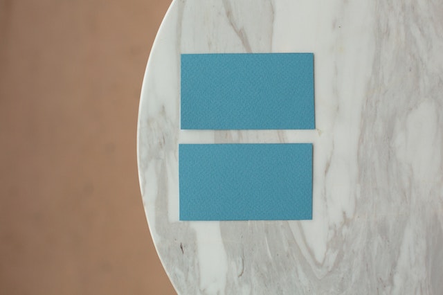
Blue implies reliability, responsibility and conservatism. It suggests a sense of calmness and tranquillity, promoting physical and mental relaxation.
Blue enhances one-to-one communication so it would be a good choice for a professional counsellor, a psychologist, an accountant or financial advisor to use for their visiting card.
The darker the blue, the more professional, serious, authoritative and conservative it is.
The lighter the blue, the less authoritative and conservative it is – there is more freedom and creativity in pale blue.
Choose mid to dark blue if you want to promote that you are a reliable and trustworthy business, are ambitious and determined.
2. White- White visiting cards are standard, safe and conservative and used by a majority of businesses as a part of their business stationery.
Most cards use white as their base so if you want to stand out from the crowd white is not the best choice unless you have a logo and colors that will stand out and distinguish you from all the others.
A white card is a blank canvas, so you can be as creative as you wish – just make sure it sets you apart from your competitors.
The more colors you use on it and the lighter the colors, the less serious your business image will be.
White is suitable for almost all visiting cards and most target markets but it may not be the best choice if you really want to stand out.
3.Orange – Orange visiting cards are powerful and serious. They can suggest sophistication and elegance on one hand, and mystery and intimidation on the other.
An orange visiting card tends to stand out amongst white and all other color cards.
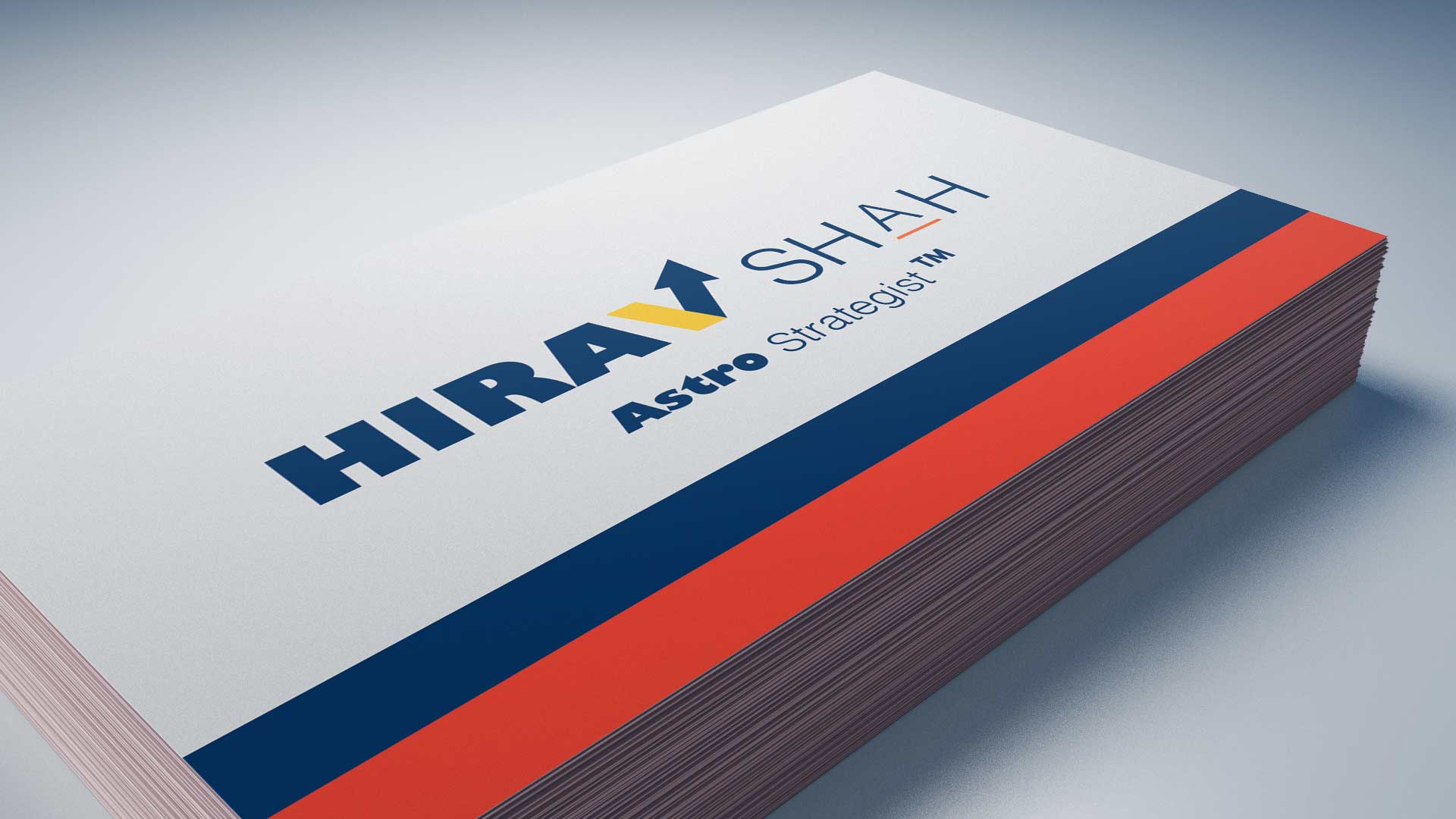
Adding golden or blue or green printing to an Orange/White card can look classy and elegant and also these are the most auspicious colors for 2021, Opines Renowned Astro-Strategist, Hirav Shah.
You can also choose printing in any other color that psychologically sends the message you want to send to your potential customers. Orange, yellow, turquoise, pink, magenta or light purple all can look very effective on black cards, depending on your business and the messages you want to send, but “Blue, Green and Golden” will certainly be the most favourable ones, anyday “- Avers Hirav Shah.
Final Words: A visiting card is a physical object that a potential prospect leaves the encounter with.
” Your brand stays with them. Make sure you are using the right colors for them ” – Concludes Hirav Shah.